How to Read Stock Scanner Results for Beginners: A Plain-English Guide
The first time you open a stock scanner, the results list looks like a spreadsheet that someone dropped on the floor. Columns everywhere. Abbreviations you half-recognize. Numbers that seem important but give you no clear instruction. You know something is happening in the market. You just can't tell what to do about it.
That confusion is normal, and it has a specific cause: most scanners were designed by engineers who already know what every column means. This guide is written for the other direction — starting from the results page and working backward to plain English. By the end, you'll know what each column is telling you, how to separate a real statistical edge from noise, and how to triage a list of 20+ results down to 3 or 4 names worth a second look.
What You're Actually Looking At (And Why It Feels Overwhelming)
Stock scanner results come in two fundamentally different flavors, and mixing them up is the first mistake beginners make.
The first type is a raw filter result. You set conditions — RSI below 30, price above the 50-day moving average, volume above average — and the scanner returns every stock that currently meets those conditions. The list might have 200 names on it. There's no ranking, no historical context, and no explanation of why any of these stocks are worth your attention beyond the fact that they passed your filter right now.
The second type is a backtested setup card. Here, the scanner has already done the historical work. It knows that when a specific combination of conditions fires on a specific instrument, the outcome has been profitable X% of the time over Y historical occurrences, with an average gain of Z%. The result isn't just "this stock passed a filter." It's "this pattern has a documented track record, and here's what it looks like."
Most beginners start with raw filters because that's what the major free tools offer. The problem is that a raw filter result tells you nothing about whether the pattern has ever worked. You're flying on intuition dressed up as data.
Understanding which type of result you're looking at changes how you read everything else on the page. With a raw filter, you're doing all the edge-validation yourself. With a backtested setup, the historical work is already done, your job is to read the metrics correctly and decide whether this specific instance fits your plan.
The Core Columns: What Each One Actually Means
Whether you're reading a raw screener or a backtested setup card, most results pages share a common set of columns. Here's what each one is actually measuring.
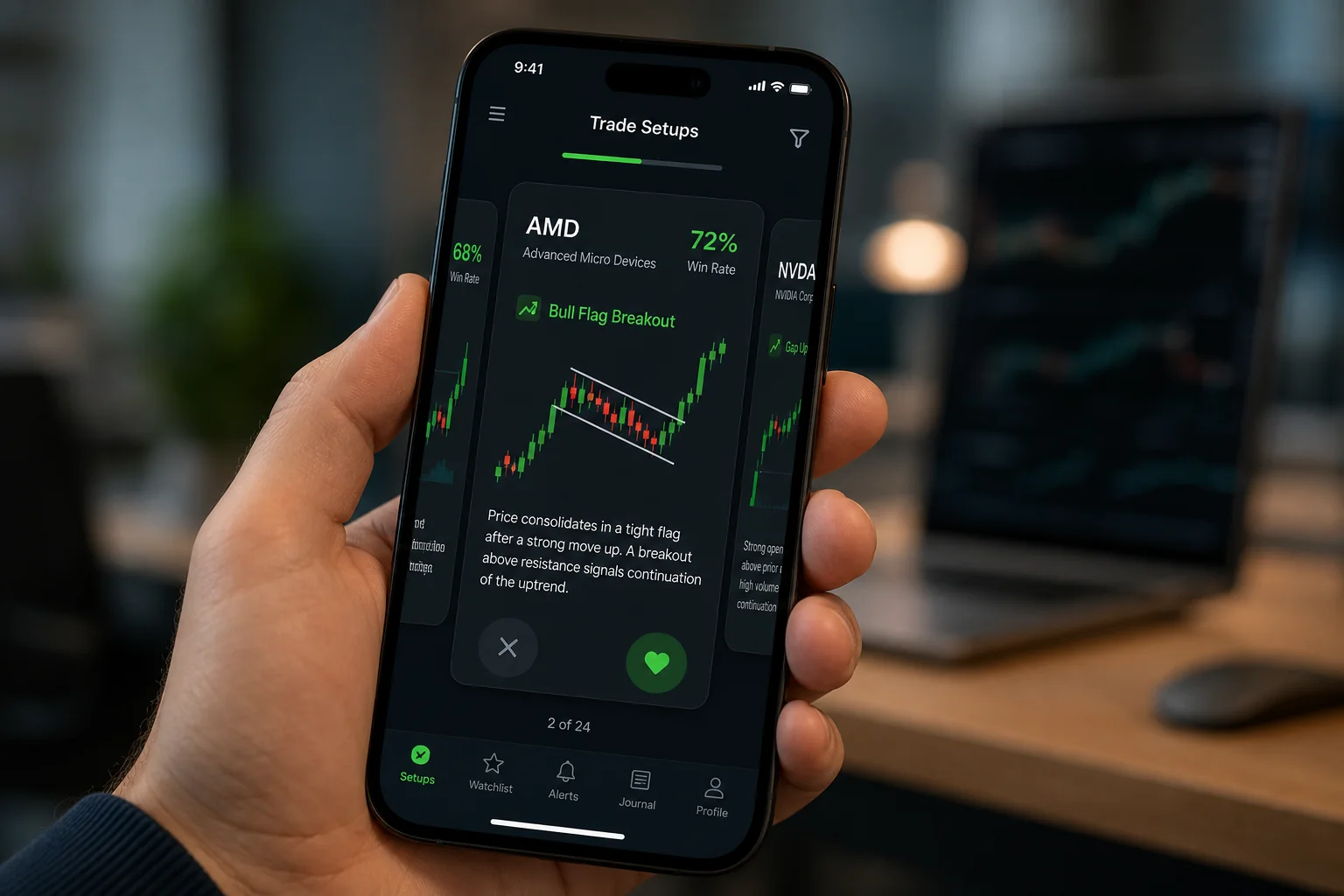
Setup or Screen Name
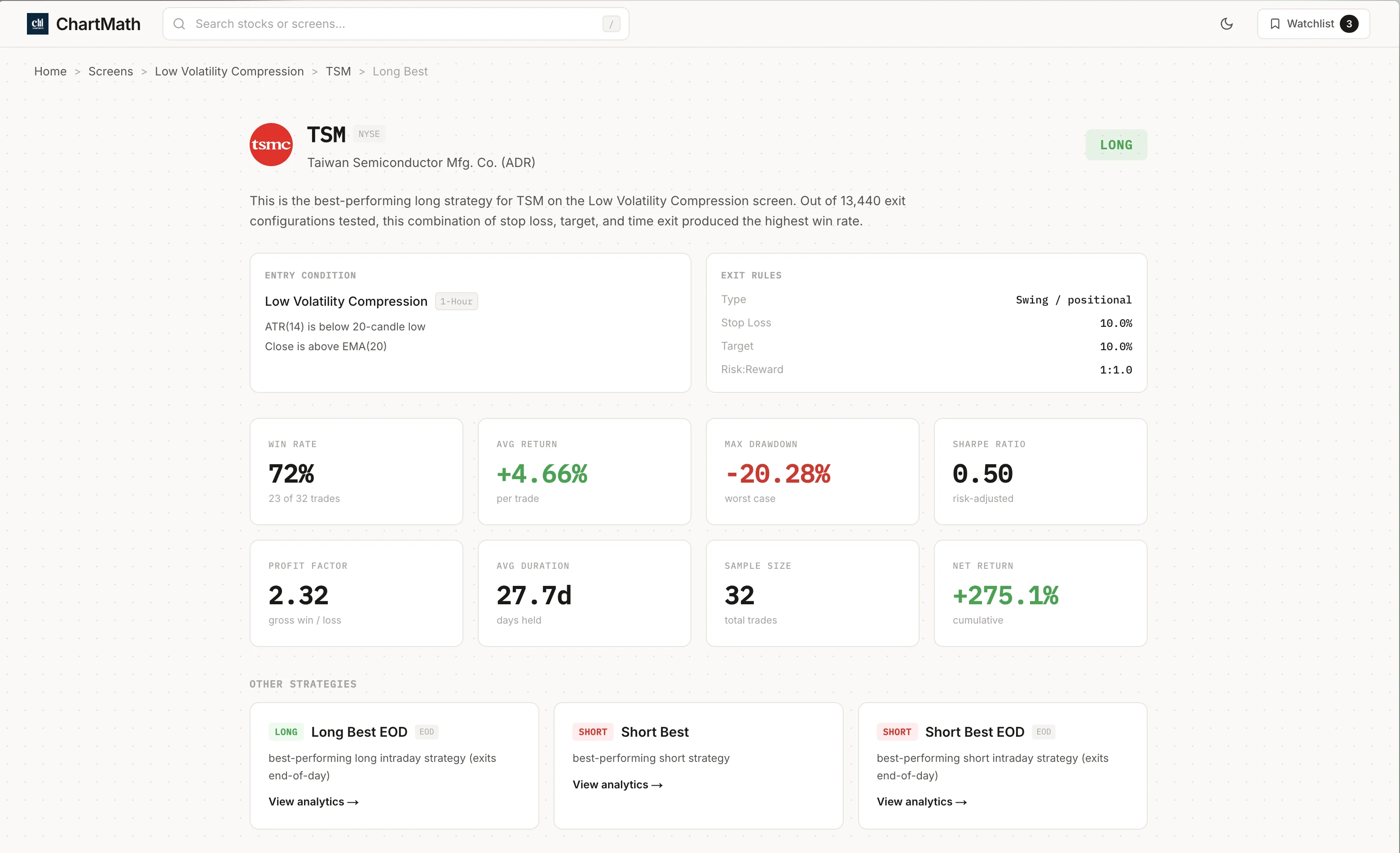
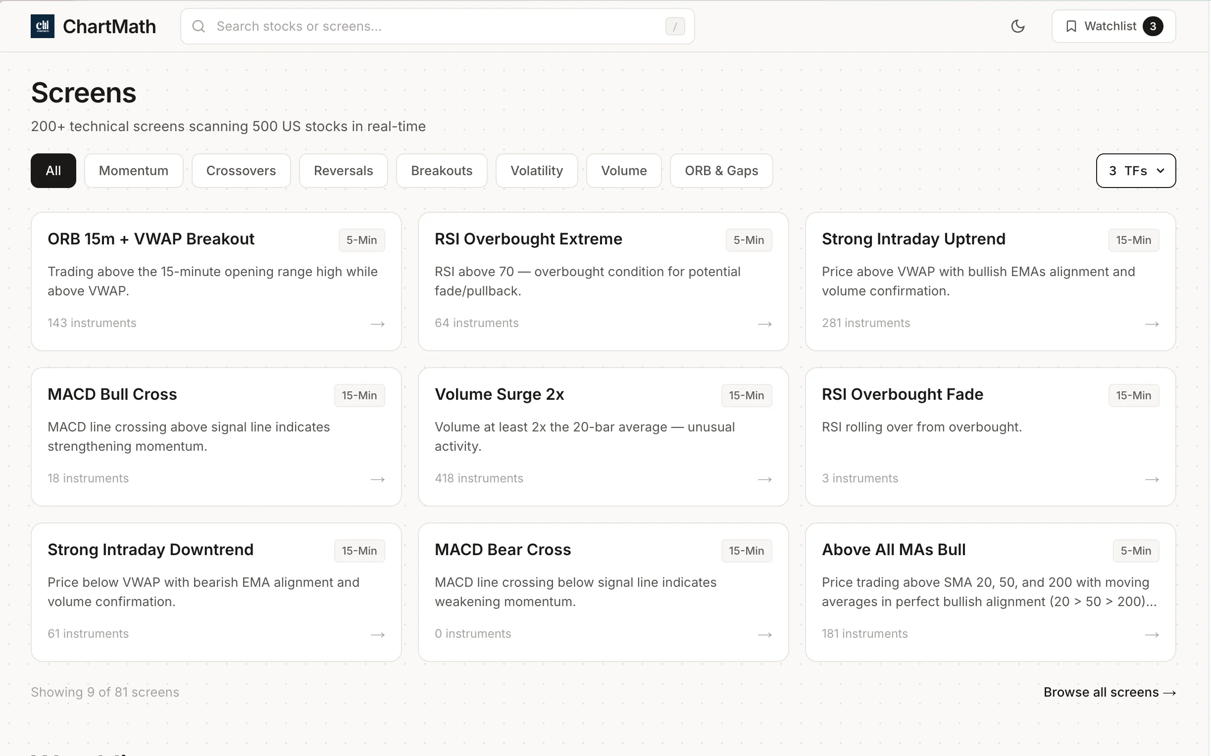
This is the name of the rule that triggered. "VWAP Reclaim," "ORB Breakout," "RSI Oversold Bounce," "52-Week High Breakout", each of these is a deterministic rule applied to price and volume data. When you see a setup name, you're seeing the label for a specific combination of conditions that all fired at the same time on this instrument. The name is a shortcut; the underlying logic is what matters. A good screener will let you see that logic in plain English.
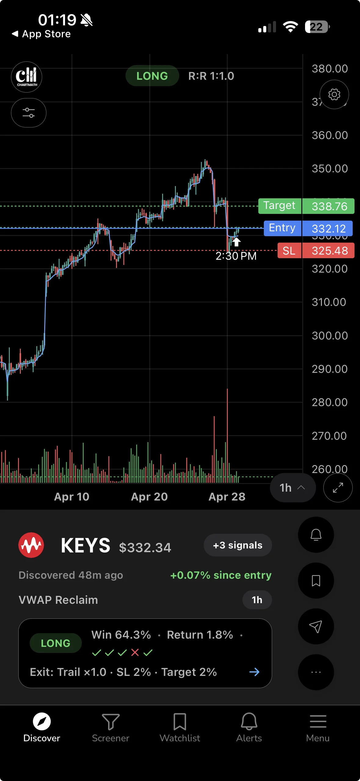
Symbol and Timeframe
The symbol tells you which instrument triggered. The timeframe tells you which bar the conditions fired on. A "VWAP Reclaim" on a 5-minute chart is a very different trade from the same setup on a daily chart. The 5-minute version is an intraday scalp. The daily version is a potential multi-day swing. Always check the timeframe before you do anything else with a result, because it determines your holding period, your stop distance, and whether the trade is even compatible with your schedule.
For traders with a day job, daily and weekly timeframes are usually the most actionable. A 1-minute signal that requires you to be at your desk at 9:35 AM is not a signal you can trade from a conference room. For more on matching timeframes to your schedule, see Swing Trading with a Full-Time Job: A Real System.
Win Rate
Win Rate is the percentage of historical occurrences of this setup that produced a profitable outcome. If a screen shows a 62% win rate, it means that in the historical data, 62 out of every 100 times this pattern fired, the trade closed in profit under the defined exit conditions.
Win Rate is useful, but it's only half the picture. A 62% win rate where the average winner gains 1% and the average loser loses 4% is a money-losing strategy. You need to read Win Rate alongside Average Return, which is covered in the next section.
Average Return
Average Return is the mean percentage gain or loss across all historical occurrences of the setup, winners and losers combined. This is the number that tells you whether the edge is real. A positive Average Return means the setup has historically made money on balance. A negative one means it hasn't, regardless of what the Win Rate says.
Sample Size
Sample size is the number of historical occurrences the Win Rate and Average Return are calculated from. This is the column most beginners ignore, and it's the one that matters most for statistical credibility.
A setup with a 78% win rate and 12 historical occurrences is not a reliable edge. That's 12 coin flips. You could get 9 heads in a row by chance. A setup with a 58% win rate and 200 historical occurrences is far more meaningful. The larger the sample, the more confident you can be that the win rate reflects a real pattern rather than luck. As a rough starting point, treat anything under 30 occurrences with significant skepticism.
RVOL (Relative Volume)
Relative Volume, often abbreviated RVOL, compares a stock's current trading volume to its average volume over the same time of day. An RVOL of 2.0 means the stock is trading at twice its normal volume right now. An RVOL of 0.5 means it's unusually quiet.
RVOL matters because price moves on high volume are more likely to sustain than moves on thin volume. When a breakout fires on 3x relative volume, institutional and retail participation is confirming the move. When the same breakout fires on 0.8x volume, it may be a false start. For a deeper look at how to use RVOL in practice, see Volume Analysis for Day Traders: How to Use RVOL and Volume Spikes.
ATR (Average True Range)
Average True Range measures how much a stock typically moves in a single bar, expressed in dollars or percentage. ATR is not a directional signal, it doesn't tell you whether the stock will go up or down. It tells you how much room to give a stop loss and how much potential movement to expect. A stock with an ATR of $3 on a daily chart needs a stop at least $3 away from your entry to avoid being stopped out by normal noise. Use ATR to size your stop, not to predict direction.
Float
Float is the number of shares available for public trading. Low-float stocks (typically under 20 million shares) tend to move faster and more violently because there are fewer shares to absorb buying or selling pressure. High-float stocks are generally more stable. For beginners, high-float stocks on daily or weekly timeframes are usually easier to manage because the moves are more predictable and the bid-ask spreads are tighter.
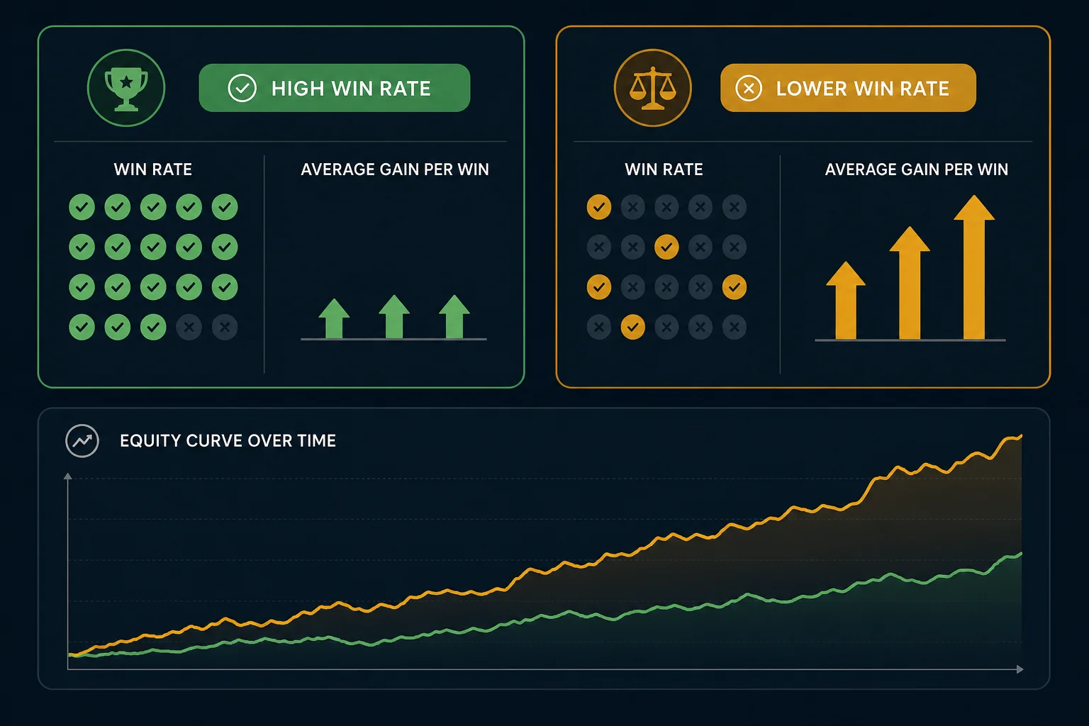
Win Rate vs. Average Return: Reading Them Together
This is the concept that separates traders who understand scanner results from those who just chase the highest win rate on the list.
Consider two setups side by side:
- Setup A: 68% Win Rate, -0.8% Average Return
- Setup B: 44% Win Rate, +2.1% Average Return
Setup A wins more often. Setup B makes more money. If you only looked at Win Rate, you'd pick Setup A and lose money systematically. If you read both columns together, Setup B is the obvious choice.
The number that combines both into a single figure is Expected Value (EV). EV is calculated as: (Win Rate × Average Win) minus (Loss Rate × Average Loss). A positive EV means the setup makes money on average over many occurrences. A negative EV means it doesn't, no matter how good it feels in the moment.
You don't need to calculate EV manually every time. The key habit is to look at Win Rate and Average Return together, not in isolation. If Average Return is negative, the setup is not worth trading regardless of the win rate. If both are positive and the sample size is meaningful, you have a candidate worth investigating further.
One important caveat: the backtests behind these numbers use bar-close entries with no look-ahead bias. They do not model commissions, slippage, or bid-ask spread. Real-world results will differ, sometimes meaningfully on thinly traded names. Factor that in when you evaluate Average Return figures, especially on smaller-cap stocks where spreads are wider. For a deeper dive into how backtesting works and what the numbers actually mean, see How to Build Winning Backtesting Strategies: A Complete Guide.
How to Tell a Real Edge From Noise
Scanner results can look compelling even when they're statistically meaningless. Here's how to filter out the noise before you risk capital.
The Sample Size Threshold
As mentioned above, fewer than 30 historical occurrences is a thin sample. Fewer than 15 is essentially anecdotal. When you see a setup with a spectacular win rate and a tiny sample, the honest interpretation is: "This hasn't happened enough times to know if it works." Move on.
The "Too Good to Be True" Test
A 90%+ win rate on any setup should trigger immediate skepticism. Real edges in liquid markets are rarely that clean. If you see a 94% win rate, check the sample size first. If it's 11 occurrences, that's noise. If it's 300 occurrences, look more carefully at the exit conditions, sometimes a very tight take-profit target inflates win rate while keeping average return low. The edge may be real but small.
Recency vs. History
A setup that worked beautifully in a trending bull market may not generalize to a choppy or bear market environment. When evaluating a screen's historical metrics, consider whether the backtest period includes different market regimes. A screen with a strong win rate across multiple years of data, including volatile periods, is more credible than one that only worked during a single sustained trend.
The Data-Mining Trap
If you build your own custom screen by testing hundreds of filter combinations until you find one with a high win rate, you've likely found a pattern that fits the historical data by accident rather than by logic. This is called data-mining or overfitting. Pre-built, independently backtested screens avoid this trap because the rules were defined before the backtest was run, not after. That's a meaningful structural advantage for beginners who don't yet have the experience to design rules that generalize.
Triaging a Results List Into a Short Shortlist
A scanner that returns 40 results is not useful until you can reduce it to 3 or 4 names worth a real look. Here's a five-step triage process that works for most beginners.
Step 1: Filter by Sample Size First
Before you look at anything else, remove every result with fewer than 30 historical occurrences. This single step often cuts a long list in half. You're not saying those setups are bad, you're saying you don't have enough data to evaluate them yet. Focus on what you can evaluate with confidence.
Step 2: Check Win Rate and Average Return Together
From the remaining results, remove any setup where Average Return is negative. Then sort the remaining list by a combination of Win Rate and Average Return, you want both to be positive, and ideally the Average Return should be meaningfully larger than the typical spread and commission cost you'll pay to execute the trade.
Step 3: Confirm RVOL
For any setup that survived steps 1 and 2, check the current relative volume. Is the stock trading above its average volume right now? A setup firing on elevated RVOL has more participation behind it. A setup firing on below-average volume may be a false signal or a low-conviction move. For swing trades on daily charts, look for RVOL above 1.0 at minimum, and ideally above 1.5 on the signal bar.
Step 4: Match the Timeframe to Your Schedule
A 1-minute ORB breakout is not a trade you can manage from a meeting. A daily chart VWAP reclaim is something you can monitor with a price alert and act on at lunch or after the close. Filter your results by the timeframes you can actually trade given your schedule. If you have a day job, daily and weekly setups are your primary hunting ground. For more on building a workflow around your schedule, see How to Trade Stocks Without Watching Screen All Day.
Step 5: Cross-Reference With Your Watchlist
The best trade is usually a setup on a stock you already know. If a scanner result fires on a name you've been tracking, you understand the business, you've watched the chart, you know where the key levels are, you can act with more confidence than on a name you've never seen before. Cross-referencing scanner results against your existing watchlist is a simple habit that dramatically improves decision quality.
After these five steps, you should have 3 to 5 candidates. That's a manageable number to verify on your charting platform before deciding whether to act.
How Alert Speed Up Pattern Recognition
Most scanners tell you what triggered. Very few tell you why it matters.
The difference looks like this. A raw scanner result might show: "KEYS, VWAP Reclaim, Daily." That's the what. A plain-English explanation adds: "Price crossed back above VWAP after trading below it for three bars, with relative volume running at 1.8x the daily average." That's the why.
The second version does something the first doesn't: it teaches you. Every time you read a plain-English explanation of why a setup fired, you're building a mental model of what that pattern looks like in real market conditions. After reading 50 VWAP reclaim explanations, you start to recognize the setup on a chart before the scanner tells you it's there. That's pattern recognition, and it's how experienced traders develop intuition, not from years of staring at charts in isolation, but from repeatedly connecting a named pattern to a concrete market condition.
For beginners, this is one of the most underrated benefits of a well-designed screener. The explanation is the education. To understand VWAP more deeply as a concept, see VWAP Trading: How to Use Volume-Weighted Average Price.
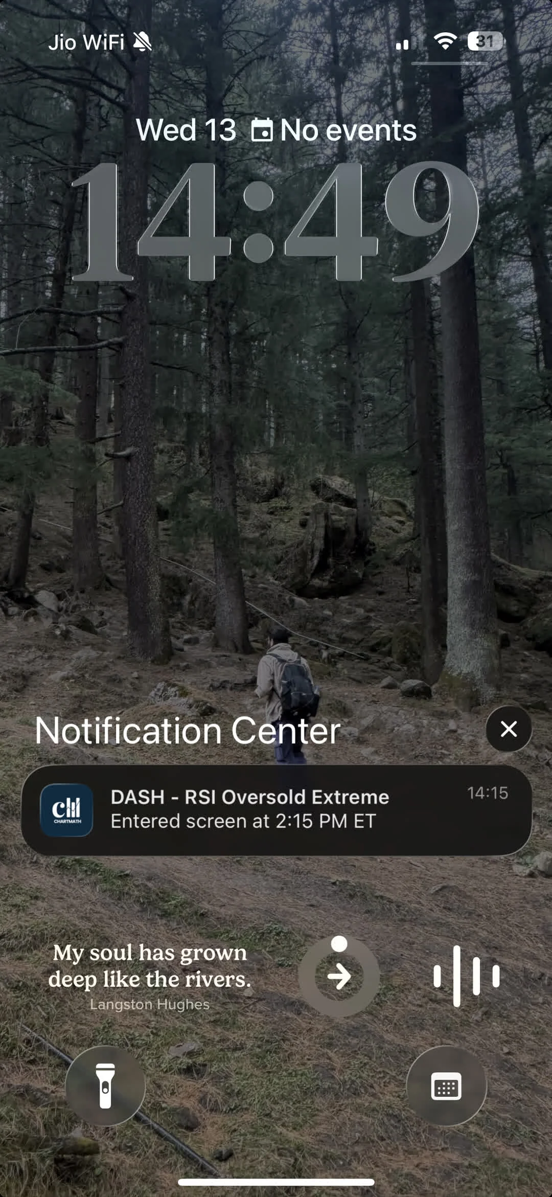
The same principle applies to alerts. When a push notification fires on your phone and tells you "TSM just broke out of its opening range on the 15-minute chart with 2.3x relative volume," you're not just getting a signal, you're getting a lesson. Over time, those lessons compound into genuine chart-reading ability, without requiring you to sit in front of a screen for eight hours a day.
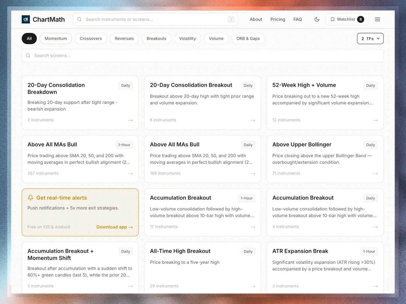
ChartMath is built around this idea. Every setup card in the Discover feed carries a plain-English reason for why it fired, alongside the backtested Win Rate and Average Return for that screen. The goal is to narrow the field for you while keeping you in the decision seat. It's a copilot, not an autopilot, the scanner does the scanning, you make the call.
Putting It Together: A Beginner's First Pass Through Scanner Results
Here's what a realistic first pass looks like, using ChartMath's Discover feed as the example.
You open the app after the market close. The Discover feed shows a swipe-based list of setup cards, each representing a stock that matched one of the 200+ curated technical screens during today's session. Each card shows:
- The screen name (e.g., "Low Volatility Compression")
- The symbol and timeframe (e.g., "QQQ, Daily")
- The Win Rate and Average Return for that screen historically
- The sample size so you know how much data backs those numbers
- A plain-English reason explaining what the chart is doing right now
You start with the sample size. Anything under 30, you swipe past. You're not dismissing those setups forever, you're just not acting on thin data today.
From what remains, you check Win Rate and Average Return together. You're looking for setups where both are positive and the Average Return is large enough to be meaningful after real-world execution costs.
You check the timeframe. You have a day job, so you're focused on daily and weekly setups. Intraday results go to the bottom of the list.
You cross-reference against your watchlist. Two of the remaining results are on names you've been tracking. Those go to the top.
You read the plain-English explanation for each. One of them makes immediate sense given what you know about the stock. The other is on a name you don't know well enough to act on confidently today.
You end up with one strong candidate and one to monitor. You open your charting platform, verify the setup visually, check where you'd place a stop based on ATR, and decide whether the position size fits your risk parameters. If it does, you execute in your broker. If it doesn't, you set a price alert and move on.
That's the whole workflow. The scanner narrows the field. You make the call.
ChartMath scans 500+ US equities, 100 crypto pairs, and 11 US futures across 200+ curated technical screens and 7 timeframes, from 1-minute to monthly, so the universe is broad enough to surface real opportunities without being so large that the results list becomes unmanageable. The screens are read-only and pre-built, which means there's no Pine Script, no coding, and no screen builder to learn. You browse what's there, read the metrics, and decide. For a look at the full screen library, visit chartmath.com/screens.
ChartMath is currently in open beta with the full screen library, backtests, and alerts available while early. Paid plans come later; beta users keep founding pricing. There's no better time to build the habit of reading scanner results systematically rather than acting on gut feel.
Frequently Asked Questions
What is RVOL and why does it matter for scanner results?
RVOL stands for Relative Volume. It compares a stock's current trading volume to its historical average volume for the same time of day. An RVOL above 1.0 means the stock is trading more actively than usual, which often signals that a price move has real participation behind it. For scanner results, RVOL is a confirmation tool: a setup that fires on high RVOL is generally more credible than the same setup on thin volume.
How many scanner results should I act on per day?
For most beginners, one to two trades per day is plenty. The goal of reading scanner results is not to act on everything, it's to find the one or two setups where the edge is clear, the timeframe fits your schedule, and you understand the name well enough to manage the trade. Quality over quantity is the right frame, especially early on.
Is a higher win rate always better?
No. Win Rate only tells you how often a setup closes in profit. It says nothing about how much it makes when it wins or loses when it loses. A 70% win rate with a small average gain and a large average loss is a losing strategy. Always read Win Rate alongside Average Return. The combination of both, the expected value, is what determines whether a setup has a real edge.
Do I need to know Pine Script to use a stock scanner?
Not with ChartMath. The 200+ screens are pre-built and curated, so there's no coding, no Pine Script, and no screen builder to learn. You browse the existing screens, read the metrics, and decide which setups fit your plan. For traders who've been put off by the complexity of building custom strategies in TradingView or other platforms, this is a meaningful difference. See Stock Scanner Without Pine Script: 200+ Ready-Made Screens for more on how that works.
What timeframe should a beginner focus on?
Daily and weekly charts are the most beginner-friendly timeframes for two reasons. First, the signals are slower-moving, which gives you more time to verify a setup and make a deliberate decision. Second, they're compatible with a normal work schedule, you can review results in the evening, set alerts, and act the next morning without needing to watch the market in real time. Intraday timeframes (1m, 5m, 15m) require active monitoring and are better suited to traders who can watch the market during the session.
Reading scanner results well is a learnable skill, and it starts with understanding what each column is actually measuring. Once you can read Win Rate and Average Return together, filter by sample size, confirm with RVOL, and match the timeframe to your schedule, you have a repeatable process for turning a long results list into a short, actionable shortlist.
The next step is to run it on your own tickers. Open the ChartMath screen library, find a setup that matches a name you've been watching, and read the metrics from top to bottom. Check the win rate, the average return, the sample size, and the plain-English explanation. Then decide, not on gut feel, but on evidence.
If you want the full experience on mobile, download the ChartMath app on iOS or Android. The Discover feed, the full screen library, and backtested alerts are all available in open beta while early. Build the habit now, before the market moves without you.

Ankush Jindal
LinkedInSee these setups live in ChartMath
200+ curated screens with backtest data. 14-day free trial.